浅析ExtJS 4布局组件
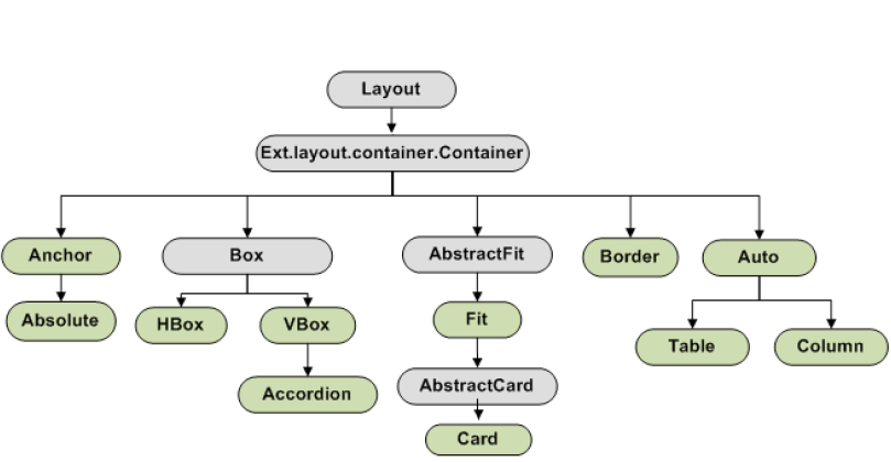
在ExtJS中,布局决定组件的位置如何分布、尺寸如何确定。ExtJS 4对整个布局体系进行了改造,布局引擎被重新编写,提高了性能。
ExtJS 4把布局分为两类:
- 容器布局(Container Layout):组织一个组件的HTML元素。包括Border Layout、Hbox Layout、Vbox Layout、Fit Layout等
- 组件布局(Component Layout):决定容器中子组件的大小、位置。包括Dock Layout、Toolbar Layout、Field Layout、TriggerField Layout等
在ExtJS 4中Auto Layout替换了ExtJS 3中的ContainerLayout,作为默认的容器布局类,如果容器没有指定布局,则自动使用Auto Layout。
Form Layout已经不再支持,并且由组件布局Field Layout(组件布局)代替。
容器布局的类层次如下图:
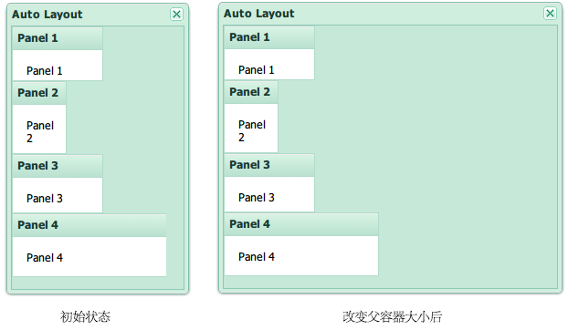
该布局的特点:
- 依据声明的顺序,子组件自上而下的排列
- 子组件需要显式声明宽高度
- 改变容器的大小后,子组件不跟随改变大小(即使子组件指定百分比)
- 如果容器的尺寸不够,子组件可能重叠在一起
代码示例:
|
1 2 3 4 5 6 7 8 9 10 11 12 13 14 15 16 |
var w = Ext.create( 'Ext.window.Window', { title : 'Auto Layout', width : 200, height : 320, layout : 'auto', defaults : { bodyStyle : 'padding:15px' }, items : [ { title : 'Panel 1', html : 'Panel 1', height : 60, width : 100 }, { title : 'Panel 2', html : 'Panel 2', height : 80, width : 60 }, { title : 'Panel 3', html : 'Panel 3', height : 65, width : 100 }, { title : 'Panel 4', html : 'Panel 4', height : 70, width : '90%'} ] } ); w.show(); |
效果图:
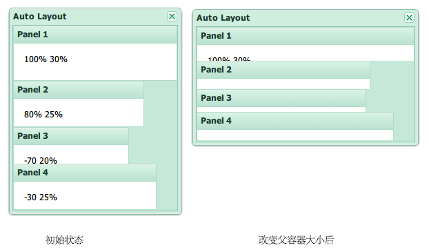
该布局的特点:
- 依据声明的顺序,子组件自上而下的排列
- 子组件依据自身指定的锚定规则(anchor配置项)来确定尺寸、位置
- 父容器大小变化后,子组件的大小自动变化
代码示例:
|
1 2 3 4 5 6 7 8 9 10 11 12 13 14 15 16 17 18 19 |
var w = Ext.create( 'Ext.window.Window', { title : 'Auto Layout', width : 250, height : 300, layout :'anchor', defaults : { bodyStyle : 'padding:15px' }, items : [ //正数表示宽高度占有容器的百分比 { title : 'Panel 1', html: '100% 30%', anchor : '100% 30%'}, { title : 'Panel 2', html: '80% 25%', anchor : '80% 25%'}, //负数表示宽高度 = 容器宽高度 - abs(负数) { title : 'Panel 3', html: '-70 20%', anchor : '-70 20%' }, //如果指定x、y,则可以指定其相对于前一个兄弟组件的位置偏移 { title : 'Panel 4', html: '-30 25%', anchor : '-30 25%', x : 0, y :0} ] } ); w.show(); |
效果图:
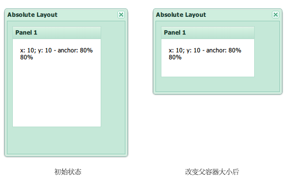
该布局的特点:
- 该布局继承自Anchor Layout,具有其特点
- 子组件根据x、y设置,相对于父容器的body左上角进行绝对定位
代码示例:
|
1 2 3 4 5 6 7 8 9 10 11 12 13 |
var w = Ext.create( 'Ext.window.Window', { title : 'Absolute Layout', width : 250, height : 300, layout :'absolute', defaults : { bodyStyle : 'padding:15px' }, items : [ { title : 'Panel 1', html: 'x: 10; y: 10 - anchor: 80% 80%', anchor:'80% 80%', x: 10, y: 10} ] } ); w.show(); |
效果图:
该布局的特点:
- 子组件水平的分布在容器内
- 通过flex配置项,可以指定子组件如何划分水平方向的空白区域
- 通过pack配置项,可以指定子组件如何在水平方向连续分布,支持值:start、center、end
- 通过align配置项,可以决定子组件在垂直方向如何对齐(或伸展),支持值:stretch、stretchmax、top、middle
代码示例:
|
1 2 3 4 5 6 7 8 9 10 11 12 13 14 15 16 17 18 19 20 21 22 23 24 25 26 27 28 29 30 31 32 33 34 35 36 37 38 39 40 41 42 43 44 45 46 47 48 49 50 51 52 |
//例一: var w = Ext.create( 'Ext.window.Window', { title : 'Hbox Layout', width : 500, height : 250, layout :{ type : 'hbox', /** * 对齐方式,决定了纵向的高度与位置: * stretch :自动伸展填满容器 * stretchmax :自动伸展,使所有子组件与最大高度子组件同高 * top :顶端对齐子组件(默认) * middle :中部对齐子组件 */ align : 'middle' }, items : [ //flex用于设置子组件占有容器可用宽度(除去固定宽度组件占用的部分)的比例 { title : 'Panel 1', html : 'flex:1', flex : 2, height : 100}, { title : 'Panel 2', html : 'flex:2', flex : 1, height : 80}, //该组件为固定宽度 { title : 'Panel 3', html : 'width:100', width : 100, height : '50%'} ] } ); w.show(); //例二: var w = Ext.create( 'Ext.window.Window', { title : 'Hbox Layout', width : 500, height : 250, layout :{ type : 'hbox', /** * pack在任何一个子组件指定了flex时没有意义 * start :靠左对齐 * center :中间对齐 * end :靠右对齐 */ pack : 'end', align : 'middle', //为所有子组件外围添加的补白 padding : '0 50 0 50' }, items : [ { title : 'Panel 1', html : 'flex:1<br>height : 100', height : 100}, { title : 'Panel 2', html : 'flex:2<br>height : 80', height : 80}, { title : 'Panel 3', html : 'width:100<br>height : 150', width : 100, height : 150} ] } ); w.show(); |
例一的效果图: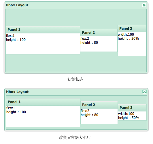
例二的效果图: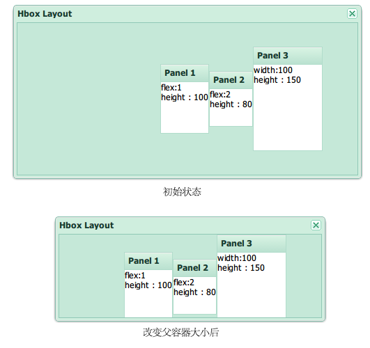
该布局的特点与Hbox非常类似,只是在排列方向上不同:
- 子组件垂直的分布在容器内
- 通过flex配置项,可以指定子组件如何划分水平方向的空白区域
- 通过pack配置项,可以指定子组件如何在垂直方向连续分布,支持值:start、center、end
- 通过align配置项,可以决定子组件在水平方向如何对齐(或伸展),支持值:stretch、stretchmax、left、center
代码示例:
|
1 2 3 4 5 6 7 8 9 10 11 12 13 14 15 16 17 |
var w = Ext.create( 'Ext.window.Window', { title : 'Vbox Layout', width : 250, height : 500, layout :{ type : 'vbox', pack : 'end', align : 'center' }, items : [ { title : 'Panel 1', html : 'width:100,height:100',width:100, height : 100}, { title : 'Panel 2', html : 'width:150,height:150',width:150, height : 150}, { title : 'Panel 3', html : 'width:120,height:120', width : 120, height : 120} ] } ); w.show(); |
效果图: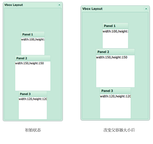
该布局是Vbox布局的子类,其特点为:
- 每次只显示一个子组件
- 可以展开某个处于收缩状态的子组件
代码示例:
|
1 2 3 4 5 6 7 8 9 10 11 12 |
var w = Ext.create( 'Ext.window.Window', { title : 'Accordion Layout', width : 200, height : 400, layout : 'accordion', items : [ { title : 'Panel 1', html : 'Panel 1', height : 100}, { title : 'Panel 2', html : 'Panel 2', height : 100}, { title : 'Panel 3', html : 'Panel 3', height : 100} ] } ); w.show(); |
效果图: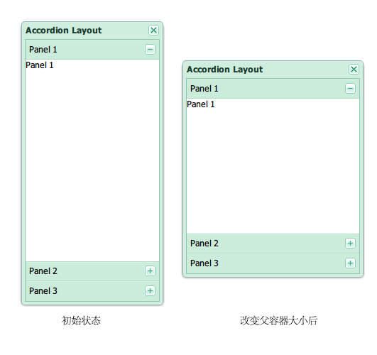
该布局的特点:
- 把组件渲染到HTML的table元素内部
- 可以指定某个子组件跨越的行、列数
代码示例:
|
1 2 3 4 5 6 7 8 9 10 11 12 13 14 15 16 17 18 19 20 21 22 23 24 25 26 27 28 29 30 31 32 33 34 35 36 37 38 39 40 41 42 |
var table = Ext.create( 'Ext.window.Window', { title : 'Table Layout', width : 400, height : 300, layout : { type : 'table', columns : 3, //表格包含的列数 tableAttrs : { //应用到生成的table元素的属性 style : { width : '90%', height : '100%' } } }, defaults : { bodyStyle : 'padding:10px' }, items : [ { html : 'Cell 1', rowspan : 3 //跨越3行 }, { html : 'Cell 2' }, { html : 'Cell 3' }, { html : 'Cell 4' }, { html : 'Cell 5' }, { html : 'Cell 6', colspan : 2 //跨越2列 }, { html : 'Cell 7' }, { html : 'Cell 8' }, { html : 'Cell 9' } ] } ); table.show(); |
效果图: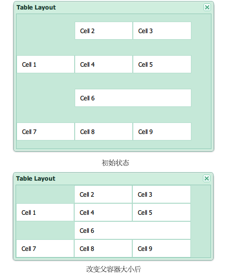
该布局的特点:
- 子组件水平分布
- 容器管理子组件的宽度,可以通过columnWidth来指定宽度
- 通常用于GridPanel的列的布局
代码示例:
|
1 2 3 4 5 6 7 8 9 10 11 12 |
var w = Ext.create( 'Ext.window.Window', { title : 'Accordion Layout', width : 400, height : 100, layout : 'column', items : [ { title : 'Panel 1', html : '.25', columnWidth: .25}, { title : 'Panel 2', html : '.25', columnWidth: .25}, { title : 'Panel 3', html : '1/2', columnWidth: 1/2} ] } ); w.show(); |
效果图: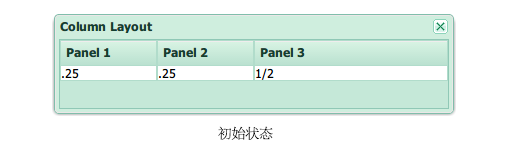
该布局的特点:
- 容器只能有唯一的子组件
- 该组件充满容器的全部可用空间
代码示例:
|
1 2 3 4 5 6 7 8 9 10 |
var w = Ext.create( 'Ext.window.Window', { title : 'Fit Layout', width : 300, height : 350, layout : 'fit', items : [ { title : 'Panel 1', html : 'Fit'} ] } ); w.show(); |
效果图: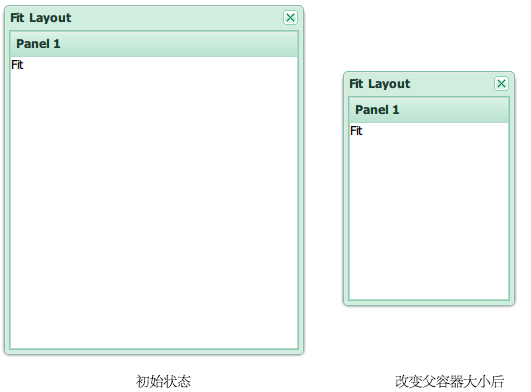
该布局是Fit Layout的子类型,特点为:
- 与Fit Layout类似,每次只能显示一个子组件
- 可以配置多个子组件
- 可以切换子组件的显示
代码示例:
|
1 2 3 4 5 6 7 8 9 10 11 12 13 14 15 16 17 18 19 20 21 22 23 24 25 26 27 28 29 30 31 32 33 34 35 36 37 38 39 40 41 42 43 44 45 46 47 48 49 50 |
function navHandler( btn ) { var activeItem = card.layout.activeItem; //获取当前激活的子组件 var active = card.items.indexOf( activeItem ); if ( btn.id == 'nextButton' ) active += 1; else if ( btn.id == 'prevButton' ) active -= 1; card.layout.setActiveItem( active ); //通过序号激活子组件 var prev = card.dockedItems.items[1].items.items[0]; var next = card.dockedItems.items[1].items.items[2]; if ( active == 0 ) prev.setDisabled( true ); else if ( active == 1 ) { prev.setDisabled( false ); next.setDisabled( false ); } else if ( active == 2 ) next.setDisabled( true ); }; var card = Ext.create( 'Ext.window.Window', { title : 'Card Layout', width : 350, height : 200, layout : 'card', activeItem : 0, defaults : { border : false }, bbar : [ { id : 'prevButton', text : 'Preivous Step', handler : navHandler, disabled : true }, '->', //该记号用于占满多余的空间 { id : 'nextButton', text : 'Next Step', handler : navHandler } ], items : [ { html : 'Step 1 of 3' }, { html : 'Step 2 of 3' }, { html : 'Step 3 of 3' } ] } ); card.show(); |
效果图: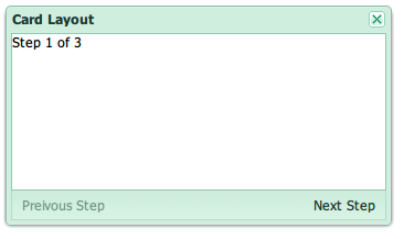
该布局的特点:
把容器划分为东西南北中五个区域:
- 最多有五个子组件,最少一个子组件,中间区域必不可少
- 每个子组件需要指定其占据的区域(region)
- 除了中间区域,其他区域可以收缩
- 南北区域可以指定高度,东西区域可以指定宽度,剩余的区域由中间占有
该布局的示意图如下: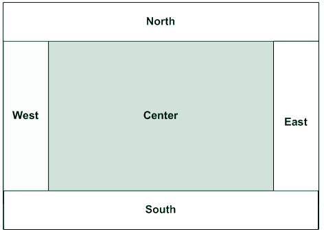
代码示例:
|
1 2 3 4 5 6 7 8 9 10 11 12 13 14 15 16 17 18 19 20 21 22 23 24 25 26 27 28 29 30 31 32 33 34 35 36 37 38 39 |
var border = Ext.create( 'Ext.window.Window', { width : 700, height : 500, title : 'Border Layout', layout : 'border', defaults : { xtype : 'panel' }, items : [ { title : 'North Region is resizable', region : 'north', //子组件占据的区域 height : 100, //南北区域可以指定高度 split : true }, { title : 'South Region is resizable', region : 'south', height : 100, split : true }, { title : 'West Region is collapsible', region : 'west', width : 200, //东西区域可以指定宽度 collapsible : true, layout : 'fit' }, { title : 'East Region is collapsible', region : 'east', width : 200, collapsible : true, layout : 'fit' }, { //剩余空间全部归中间区域 title : 'Center Region', region : 'center', layout : 'fit' } ] } ); |
效果图: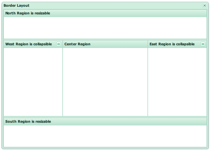
与容器布局不同,组件布局关注组件内部结构(而不是容器的子组件)组成的大小、位置。
Dock Layout主要用于提高面板头(Header)、工具栏(Toolbar)的灵活性。
考虑以下包含了若干工具栏配置的面板:
|
1 2 3 4 5 6 7 8 9 10 11 12 13 14 15 16 17 18 19 20 21 22 23 24 25 26 27 28 29 30 31 32 33 34 |
Ext.create( 'Ext.panel.Panel', { collapsible : true, width : 400, renderTo : Ext.getBody(), title : 'Ext 4 Panel - Header', html : 'Panel body HTML', //面板体的HTML内容 //顶部工具栏 tbar : Ext.create( 'Ext.toolbar.Toolbar', { items : [ { type : 'button', text : 'Button - Top Toolbar' } ] } ), //顶部工具栏 bbar : Ext.create( 'Ext.toolbar.Toolbar', { items : [ { type : 'button', text : 'Button - Bottom Toolbar' } ] } ), //脚注工具栏 fbar : Ext.create( 'Ext.toolbar.Toolbar', { items : [ { type : 'button', text : 'Button - Footer Toolbar' } ] } ) } ); |
其UI效果图如下: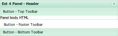
从生成的HTML元素的角度来看,该面板包含一个外部包装元素(outer wrapper element),该包装元素包含面板头、面板体包装元素两个部分,后者由顶栏、面板体元素、底栏、脚注栏几个部分组成,如下图 所示: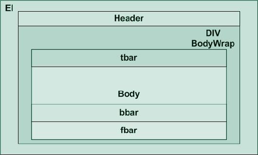
可以看到,在默认情况下,顶部工具栏、面板头、面板体、底部工具栏等的相对位置关系是固定的,ExtJS 3中,无法改变这种位置关系,ExtJS 4则包含若干改进,便于用户在多个位置摆放工具栏:
- 面板头被抽象为组件(Ext.panel.Header),允许设置其位置为top、bottom、left、right
- 可以使用dockedItems来配置各工具栏,从而将其放在任何方向
使用上述改进来配置面板头、工具栏,代码如下:
|
1 2 3 4 5 6 7 8 9 10 11 12 13 14 15 16 17 18 19 20 21 22 23 24 25 26 27 28 29 30 31 32 33 34 35 36 37 38 39 40 41 42 43 |
Ext.create( 'Ext.panel.Panel', { collapsible : true, width : 400, height : 400, border : true, renderTo : Ext.getBody(), title : 'Ext 4 Panel - Header', headerPosition : 'right', //面板头的位置,改在右边 html : 'Panel Body HTML', dockedItems : [ { xtype : 'toolbar', dock : 'left', //该工具栏放在左边 items : [ { xtype : 'button', text : 'Left Toolbar' } ] }, { xtype : 'toolbar', dock : 'bottom', items : [ { xtype : 'button', text : 'Bottom Toolbar' } ] }, { xtype : 'toolbar', dock : 'bottom', items : [ { xtype : 'component', flex : 1 }, { xtype : 'button', text : 'Footer Toolbar' } ] } ] } ); |
效果图: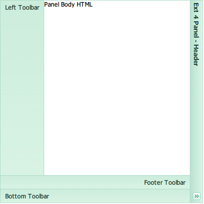
出于对ExtJS 3兼容性的考虑,ExtJS 4仍然支持tbar、bbar、fbar,并且新增了rbar、lbar两个类似的配置项。
面板头工具(Header Tools)在ExtJS 4中也作为组件看待,ExtJS会在面板头部显示一系列的图标,其行为需要用户自行定义:
|
1 2 3 4 5 6 7 8 9 10 11 12 13 14 15 16 17 18 19 20 21 22 23 24 25 26 27 28 29 30 31 32 33 34 35 36 37 38 39 40 41 42 43 44 45 46 47 48 49 50 51 52 53 54 55 56 57 |
Ext.create( 'Ext.panel.Panel', { width : 500, renderTo : Ext.getBody(), html : 'Panel', title : 'Tools - Header', tools : [ { type : 'close', handler : function() {}//定义按钮的行为 }, { type : 'collapse' }, { type : 'down' }, { type : 'expand' }, { type : 'gear' }, { type : 'help' }, { type : 'left' }, { type : 'maximize' }, { type : 'minimize' }, { type : 'minus' }, { type : 'next' }, { type : 'pin' }, { type : 'plus' }, { type : 'prev' }, { type : 'print' }, { type : 'refresh' }, { type : 'restore' }, { type : 'right' }, { type : 'save' }, { type : 'search' }, { type : 'toggle' }, { type : 'unpin' }, { type : 'up' } ] } ); |
效果图如下:
在ExtJS 4中,FormLayout不再被支持,组织表单字段布局的职责由新引入的FieldLayout承担。ExtJS 4的表单布局具有以下特性:
- 表单容器默认使用Anchor Layout
- 不再需要为字段指定绝对值宽度,而可以使用anchor指定百分比或者负数
- 表单中的单个字段(Ext.form.field.Field)的输入框、错误信息由字段布局(Field Layout)确定。在显示错误信息时,ExtJS自动收缩表单字段,以腾出空间。因此,用户不需要考虑如何为错误信息预留空间
下面是一个ExtJS 4表单的例子:
|
1 2 3 4 5 6 7 8 9 10 11 12 13 14 15 16 17 18 19 20 21 22 23 24 25 26 27 28 29 30 31 32 33 |
//通过设置ExtJS类的原型对象的属性,可以影响所有以后创建的实例 Ext.form.Field.prototype.msgTarget = 'side'; Ext.create( 'Ext.form.Panel', { frame : true, title : 'Form', margin : 5, bodyStyle : 'padding:5px 5px 0', width : 350, renderTo : Ext.getBody(), fieldDefaults : { msgTarget : 'side', labelWidth : 75 }, defaultType : 'textfield', //可以指定任何布局方式 layout : { type : 'vbox', align : 'stretch' }, defaults : { //与ExtJS 3不同,不需要指定字段宽度,而可以使用anchor指定宽度(支持百分比、负数) anchor : '100%' }, items : [ { fieldLabel : 'First Name', name : 'first' }, { fieldLabel : 'Last Name', name : 'last' } ] } ); |
与Field Layout类似,该布局机制可以为Trigger字段的错误信息自动预留空间。
Leave a Reply